In this section, I will review the statistical nature of cords. How are they attached, what twists do they have, what is the main pendant to subsidiary ratio, etc.
If you are unaware of cord construction concepts such as twist, knots, etc. I suggest you start with the Khipu Legend page.
This page is dry and somewhat unexciting, but it’s a necessary step to understanding what is needed to draw and analyze the khipus. I believe it is at the cord and cord cluster level where most of the detailed investigation of khipus will lie in Phase 3.
This page is the output of an executable Jupyter notebook. The long prologue of imports and setup has been extracted to a startup file for brevity. The first task is to complete initialization by doing final setup and importing the Python Khipu OODB (Object Oriented Database) and summary files.
Code
# Initialize plotlyplotly.offline.init_notebook_mode(connected =True);# Khipu Importsimport khipu_kamayuq as kamayuq # A Khipu Maker is known (in Quechua) as a Khipu Kamayuqimport khipu_qollqa as kq # A Khipu Qollca is a warehouse that holds khipu (and other databases)all_khipus = [aKhipu for aKhipu in kamayuq.fetch_all_khipus().values()]khipu_summary_df = kq.fetch_khipu_summary()# Since this a presentation version, turn off any idiot lightsimport warningswarnings.filterwarnings('ignore')
Primary Cords
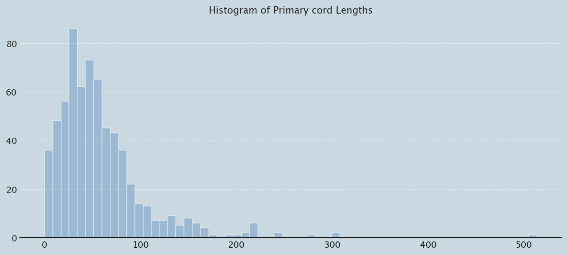
Let’s first start with primary cords, the main cord that all the cords are attached to. I’m particularly interested in their lengths, since that will have an impact on rendering…
About 20.0 cm of the main cord is tied in one large knot.
1000541
1000541
304.0
U
Final twist: Braided
1000118
1000118
300.5
Z
Main cord is Z-plyed BB:W which is S-wrapped with BB cord.
1000508
1000508
280.5
1000333
1000333
243.5
U
...
...
...
...
...
1000289
1000289
NaN
Connected to pendant #13 of UR117A.
1000293
1000293
NaN
All of the top cords are looped through the attachments of their group pendants.
1000295
1000295
NaN
#NAME?
1000328
1000328
NaN
Between 15 - 28.5 cm, primary cord bears knots:
1000452
1000452
NaN
0.0-1.5 cm ravelled end to thread-wrap (AB)
count    662.000000
mean      57.646752
std       47.536571
min        0.000000
25%       29.000000
50%       46.500000
75%       73.375000
max      513.500000
Name: pcord_length, dtype: float64
Code
prep_plot()sns.distplot(pcord_df.pcord_length.values, bins=60, color="#588bbe", kde=False, rug=False).set_title('Histogram of Primary cord Lengths');
Note that a significant number of cords (20) have 0 length. One khipu is over 500 cm in size - 17 feet long.
Cord Clusters
When you look at khipus you notice that there’s a lot of pendant cord clusters - 6 cords of white, 4 cords of black and white mottled, that sort of thing. Do these clusters and colors constitute some sort of basic structure?
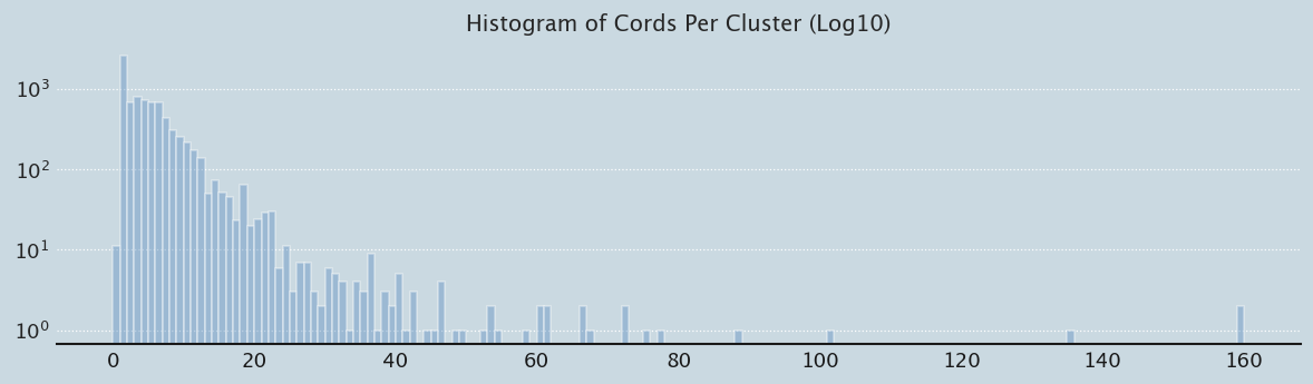
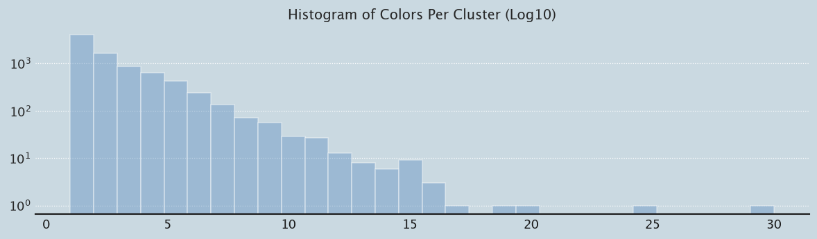
Let’s do a simple investigation for now. First let’s build the cluster table - what we’re trying to plot is number of cords per cluster versus colors. To make things simple, let’s get the grey-scale value of a cord, and then average that across the cord cluster to get an average intensity and or the number of Ascher cord colors for the cluster. The prebuilt database awaits:
cords_per_cluster =list(cluster_summary_df['cords_per_cluster'])cord_cluster_counter = Counter(cords_per_cluster)cord_count =sorted(cord_cluster_counter.most_common(), key=lambda x: x[0])colors_per_cluster =list(cluster_summary_df['colors_per_cluster'])color_cluster_counter = Counter(colors_per_cluster)color_count =sorted(color_cluster_counter.most_common(), key=lambda x: x[0])max([num_colors for num_colors, occurences in color_count])
30
Code
prep_plot(3)sns.distplot(cluster_summary_df.cords_per_cluster.values, bins=160, color="#588bbe", kde=False, rug=False, hist_kws={'log':True}).set_title('Histogram of Cords Per Cluster (Log10)');
Code
prep_plot(3)sns.distplot(cluster_summary_df.colors_per_cluster.values, bins=30, color="#588bbe", kde=False, rug=False, hist_kws={'log':True}).set_title('Histogram of Colors Per Cluster (Log10)');
Code
cluster_summary_df['marker_size'] = [10+aValue*2for aValue in cluster_summary_df.frequency.values]fig = px.scatter(cluster_summary_df, x="cords_per_cluster", y="intensity", log_x=True, size="marker_size", color="colors_per_cluster", labels={"cords_per_cluster": "Cords per Cluster (log10)", "intensity": "Average GreyScale (0-1) per Cluster"}, hover_data=['cluster_colors_set'], title="<b>Cords per Cluster vs Average GreyScale (0-1) per Cluster</b> Size is frequency of occurence", width=1200, height=750);fig.update_layout(showlegend=True).show()
In the python code, I had set a cord’s is_white predicate to True if it’s average intensity is .7. Looking at the above graphic I changed it to .75. Beyond that I can see true white is not 1.0 but close, and that true white clusters are used until about 10 cords per cluster. I note that the number of white cords drops significantly after 7 - perhaps the old saw about we can easily remember up to 7 things is the reason? After that the true colors come out so to speak. So let’s see what the reverse has to tell us:
Code
cluster_summary_df['marker_size'] = [10+aValue*2for aValue in cluster_summary_df.frequency.values]fig = px.scatter(cluster_summary_df, x="cords_per_cluster", y="colors_per_cluster", log_x =True, log_y =True, size="marker_size",color="intensity", labels={"cords_per_cluster": "Cords per Cluster (log10)", "colors_per_cluster": "#Ascher Colors per Cluster (log10)"}, hover_data=['cluster_colors_set'], title="<b>Cords per Cluster(log10) vs Colors per Cluster (log10)</b> Size is frequency of occurence", width=1200, height=750);fig.update_layout(showlegend=True).show()
Hmmnn…..
As a final preliminary EDA on cord clusters, let’s “riff” on an a theme first investigated by Jon Clindaniel - mean cord value per cluster across the number of colors in the cluster.
Code
cluster_summary_df['marker_size'] = [aValue for aValue in cluster_summary_df.cords_per_cluster.values]fig = px.scatter(cluster_summary_df, x="colors_per_cluster", y="mean_cord_value", log_x =False, log_y =False, size="marker_size", color="seriated", labels={"colors_per_cluster": "#Ascher Colors per Cluster", "mean_cord_value": "Mean Cord Value per Cluster", }, hover_data=['khipu_name','cluster_colors_set'], title="<b>Mean Cord Value per Cluster vs Colors per Cluster</b> Size is number of cords in cluster", width=1200, height=750);fig.update_layout(showlegend=True).show()
Cord Attachments
Let’s look at the distribution of cords by attachment type (up, down, recto, etc…)
Pendant Cords
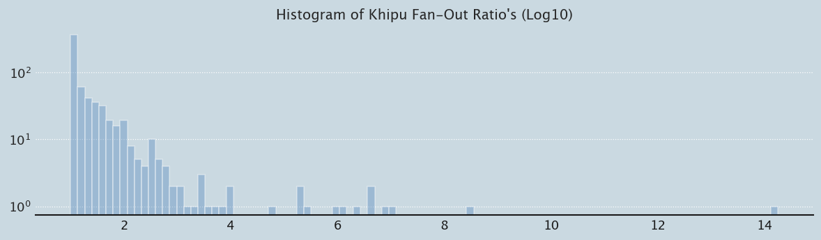
We can examine how khipus “Fan-Out” by looking at their branching structure. First let’s review top level primary “pendant” cords vs subsidiary cords attached to pendant cords. Then let’s review fan-out, the amount of braching that occurs. At this macro level, I’ll define fan-out as number of pendant cords divided by total cords (#pendant_cords + #subsidiary_cords).
Note the curious relationship between rectos and versos suggested by the dashed purple lines. Is this simply an artifact of log mapping or is there something there… To me, this indicates that versos and rectos may be involved in some sort of subdivision - for example north vs south, or east vs west.
Cord Twist (aka Ply/Spin)
Each cord has one of two ply/spin’s - affectionately known as S or Z twist depending on the diagonal’s direction in the string. Let’s plot that distribution.
Urton in Sign of the Inka Khipu spends quite some time on mixed twist khipus. I note that mixed twist khipus occur in only approximately 5% of the khipus in the Harvard database.
Code
print(f"{khipu_summary_df[khipu_summary_df.num_z_cords >0].shape[0]} khipus exist with Z cords")print(f"{khipu_summary_df.num_z_cords.sum()} Z cords exist - about {100*khipu_summary_df.num_z_cords.sum()/khipu_summary_df.num_cords.sum()} % of all cords")mixed_ply_df = khipu_summary_df[(khipu_summary_df.num_z_cords >0) & (khipu_summary_df.num_s_cords >0)].sort_values('num_z_cords',ascending=False)mixed_ply_df = mixed_ply_df[['khipu_id', 'kfg_name', 'num_cord_clusters', 'benford_match', 'num_cords', 'num_s_cords', 'num_z_cords','num_total_cords','num_ascher_colors']]print(f"{mixed_ply_df.shape[0]} khipus have mixed twist construction")display_dataframe(mixed_ply_df)
80 khipus exist with Z cords
2912 Z cords exist - about 5.226130653266332 % of all cords
34 khipus have mixed twist construction
See Full Dataframe in Mito
khipu_id
kfg_name
num_cord_clusters
benford_match
num_cords
num_s_cords
num_z_cords
num_total_cords
num_ascher_colors
71
1000629
JC005
6
0.652365
149
1
148
149
28
235
6000092
UR292A
9
0.513569
56
3
52
56
16
94
6000079
UR054
115
0.788527
115
6
47
115
2
74
1000314
UR1095
10
0.913865
212
171
40
212
5
135
1000310
UR1087
2
0.948618
97
61
36
97
6
...
...
...
...
...
...
...
...
...
...
51
1000329
UR119
49
0.893283
304
301
1
304
22
37
1000275
UR089
9
0.804845
288
286
1
288
37
17
1000020
UR003
15
0.645978
758
749
1
758
36
11
1000344
UR1084
26
0.840853
319
298
1
319
13
631
1000339
UR096
3
0.936845
57
45
1
57
26
Cord Knots
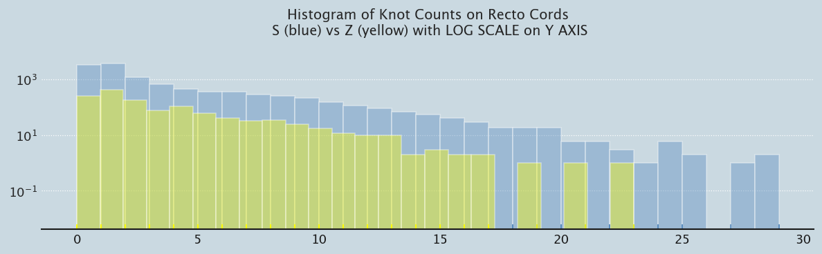
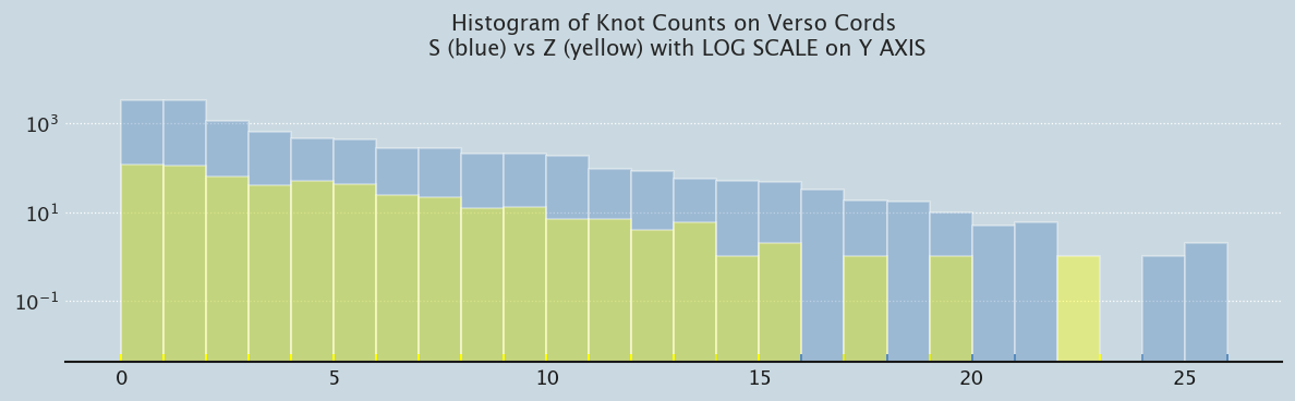
Knot Distribution on Recto/Verso Cords
What about the distribution of Recto/Verso and S/Z Twist Knots
Code
from khipu_cord import fetch_cordr_cords_df = khipu_pendants_df[khipu_pendants_df.attachment_type=='R']v_cords_df = khipu_pendants_df[khipu_pendants_df.attachment_type=='V']SR_cord_df = r_cords_df[r_cords_df.twist =='S']SR_cords = [fetch_cord(aCordID) for aCordID in SR_cord_df.cord_id.values]SR_knots = [aCord.num_knots() for aCord in SR_cords] ZR_cord_df = r_cords_df[r_cords_df.twist =='Z']ZR_cords = [fetch_cord(aCordID) for aCordID in ZR_cord_df.cord_id.values]ZR_knots = [aCord.num_knots() for aCord in ZR_cords] SV_cord_df = v_cords_df[v_cords_df.twist =='S']SV_cords = [fetch_cord(aCordID) for aCordID in SV_cord_df.cord_id.values]SV_knots = [aCord.num_knots() for aCord in SV_cords] ZV_cord_df = v_cords_df[v_cords_df.twist =='Z']ZV_cords = [fetch_cord(aCordID) for aCordID in ZV_cord_df.cord_id.values]ZV_knots = [aCord.num_knots() for aCord in ZV_cords]
Code
prep_plot(3)p1 = sns.distplot(SR_knots, bins=29, kde=False, rug=True, color ="#588bbe", hist_kws={'log':True});p1 = sns.distplot(ZR_knots, bins=24, kde=False, rug=True, color ="yellow", hist_kws={'log':True})p1.set_title('Histogram of Knot Counts on Recto Cords\n S (blue) vs Z (yellow) with LOG SCALE on Y AXIS');
Code
prep_plot(3)p1 = sns.distplot(SV_knots, bins=26, kde=False, rug=True, color ="#588bbe", hist_kws={'log':True})p1 = sns.distplot(ZV_knots, bins=23, kde=False, rug=True, color ="yellow", hist_kws={'log':True})p1.set_title('Histogram of Knot Counts on Verso Cords\n S (blue) vs Z (yellow) with LOG SCALE on Y AXIS');
Code
# plt.figure(figsize=(14,8))# plt.grid(linestyle='dotted', linewidth=.75, axis='y')fig = px.scatter(mixed_ply_df, x="num_s_cords", y="num_z_cords", size="num_cords", color="num_cords", labels={"num_s_cords": "#S Twists", "num_z_cords": "#Z Twists"}, hover_data=['kfg_name'], title="<b>Mixed Twist Khipus: S Twist Cords vs Z Twist Cords by Khipu</b>", width=1200, height=750);fig.update_layout(showlegend=True).show()
Z-Cords vs S-Cords Knot Distribution
Urton suggests that perhaps the Z twist cords might be narrative in nature. I’m curious what the number of knots distributed over Z cords looks like: vs S cords
Code
from khipu_cord import fetch_cordfrom collections import CounterS_cord_df = kq.cord_df[kq.cord_df.twist =='S']S_cords = [fetch_cord(aCordID) for aCordID inlist(S_cord_df.cord_id.values)]S_knots = [aCord.num_knots() for aCord in S_cords] print("S Cord Knot Counter:")knot_counter = Counter(S_knots)for key insorted(knot_counter):print(f"{key}: {knot_counter[key]}")print("\n")Z_cord_df = kq.cord_df[kq.cord_df.twist =='Z']Z_cords = [fetch_cord(aCordID) for aCordID inlist(Z_cord_df.cord_id.values)]Z_knots = [aCord.num_knots() for aCord in Z_cords] print("Z Cord Knot Counter:")knot_counter = Counter(Z_knots)for key insorted(knot_counter):print(f"{key}: {knot_counter[key]}")
hist_data = [S_knots, Z_knots]group_labels = ['S_Cords', 'Z_Cords']colors = ['#835AF1', '#B8F7D4']# Create plotly distplot with custom bin_size(ff.create_distplot(hist_data, group_labels, colors=colors, bin_size=1, show_rug=False,show_curve=False) .update_layout(title_text='<b>Number of Knots by Cord Twist</b>', # title of plot xaxis_title_text='Number of Knots', # xaxis label yaxis_title_text='Count', # yaxis label width=1200,#bargap=0.2, # gap between bars of adjacent location coordinates#bargroupgap=0.1 # gap between bars of the same location coordinates ) .show())